


 |
| Chris seemed to love the piece in general. The only piece of criticism he gave was to remove the colons after the title fighting for first as they don't follow conventions of other media products. |
 |
| I asked for feedback to see if people thought that my narrative structure was good and interesting. Every single person that answered my questionnaire agreed that it is a good idea and very interesting and engaging. This tells me that my documentary has a strong narrative structure and will be appealing to the target demographic. |
 |
| I also wanted to find out if people liked the name of my documentary. In order to ensure the answers are legitimate I asked the question by asking which name people preferred as I felt if I just asked if they like the name people would be tempted to just say yes, so by doing this I will get more accurate feedback. Regardless of this my results still show the name of my documentary is the most popular receiving all but 3 of the votes. |
 |
| As the quality of footage is very important to a successful piece I wanted to ensure that the audience thought the footage is of a high resolution. 100% of the people I asked answered yes, meaning the equipment I used is good enough and I don't need to improve anything. |
 |
| Having an appropriate target audience is important to ensure that the product is being produced to meet the expectations and need that these people will have from a documentary. The general answer was younger people from older teens till about 30, and mainly males as all of my footage shows male cycling and doesn't represent women. |
 |
| Following codes and conventions is an important aspect to creating a piece as this allows the audience to recognise the product. 94% of people agreed that my product did this. |
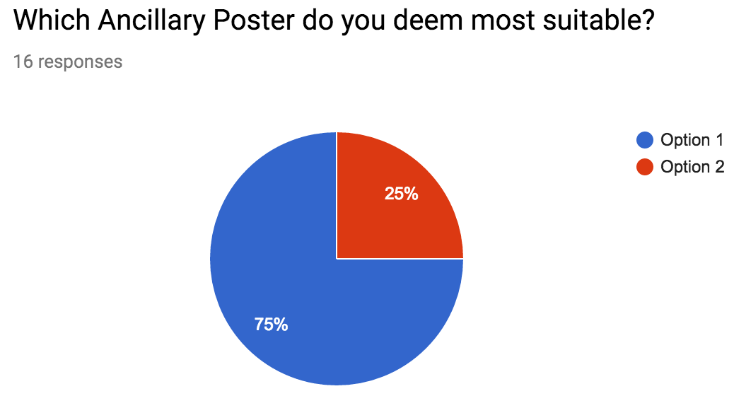 |
| From my questionnaire I can see that my first ancillary product poster is by far the most popular. Due to this I will go with what people like the best and use this as my final product. |
 |
| My posters must follow conventions of real products to allow them to easily be identified. 100% of people agreed that they did this successfully meaning that they will be easily seen as fit for the purpose by all people. |
 |
| Brand identity is very important, this is created by all products sharing similar features and due to this clearly relating to each other. All of the people in my questionnaire agreed that my poster relates to my documentary meaning I have a strong sense of brand identity and it will be clear that the poster is advertising my documentary. |
