Saturday, 3 March 2018

The Brief

7. An extract from an original documentary TV programme, lasting approximately five minutes, together with two of the following three options:

• a radio trailer for the documentary
• a double-page spread from a listings magazine focused on the documentary
• a newspaper advertisement for the documentary

Wednesday, 7 February 2018

Audience Feedback: Final feedback

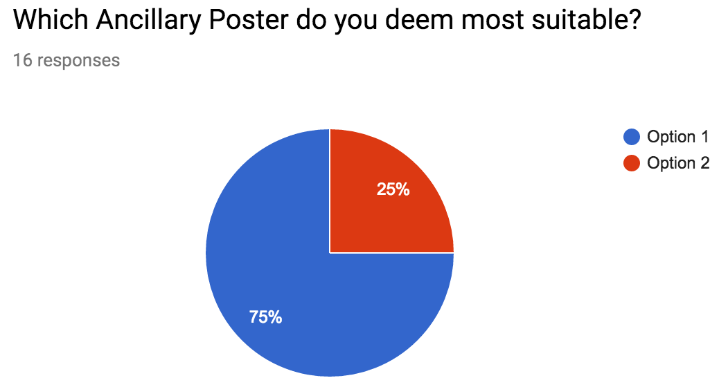
I contacted the members of my focus group and sent them a questionnaire with a link to my almost final documentary edit and asked them a few final questions to ensure my documentary is okay.

My first concern was if the quality of the audio and video is good enough to meet audience expectations. It was reassuring to have them all say that they think both are up to standard.


My next question was is the pace of editing fast enough. I got 100% yes responses for this. 


The next question I wanted answering is does the documentary follow codes and conventions as for it to be successfully identified this is very important. once again I had succeeded in doing this as all of my focus group agreed that it did.


My final question was is there any improvements I need to make before I finish the project. One comment I noticed that was mentioned more than once was that the interview with Rob needed breaking up, in order to solve this I interviewed his coach and edited this in at a relevant point. 


Friday, 2 February 2018

Audience Feedback: Final Products

I decided to send my Double Page spread to two of my friends, both of who are interested in sport. I did this to get some final feedback and get another view point on my work other than my focus group. I will use this feedback to make some final adjustments to them before completing my work.
Max pointed out that there was a spelling error in my work, this shows that I need to proof read my work before exporting it. He also said that the text next to the image should be larger to be easier to read. But he did say that he likes the image covering almost all of the page.
Josh said that I need more text in the bottom right hand corner of my page, but also said that the page is easy on the eye and very intriguing. This is very positive and useful feedback.

Saturday, 16 December 2017

Production: Documentary Audio Fade

I wasn't happy with how when I inserted one of my interviews the audio seemed very jumpy as he started talking. To counter this I wanted it to slightly fade in terms of volume. In order to do this I found a tutorial and then used the effects tab in premier pro to apply a constant power audio crossfade transition and then made it shorter so that the volume increased quicker. 

Thursday, 7 December 2017

Production: Ancillary V2 Changes

After asking a member of my focus group for feedback I went back into inDesign and made the changes they recommended. I removed the colon after the name of the documentary as it is not necessary and doesn't match convention.  
I then exported it again with the changes made. 

Audience feedback: Ancillary Poster V2

I asked a member of my focus group for feedback for any little changes I could make to my second production of my Ancillary poster and this is the feedback I received. 
Chris seemed to love the piece in general. The only piece of criticism he gave was to remove the colons after the title fighting for first as they don't follow conventions of other media products. 

Wednesday, 6 December 2017

Audience Feedback: Questionnaire

I asked for feedback to see if people thought that my narrative structure was good and interesting. Every single person that answered my questionnaire agreed that it is a good idea and very interesting and engaging. This tells me that my documentary has a strong narrative structure and will be appealing to the target demographic. 

I also wanted to find out  if people liked the name of my documentary. In order to ensure the answers are legitimate I asked the question by asking which name people preferred as I felt if I just asked if they like the name people would be tempted to just say yes, so by doing this I will get more accurate feedback. Regardless of this my results still show the name of my documentary is the most popular receiving all but 3 of the votes.  

As the quality of footage is very important to a successful piece I wanted to ensure that the audience thought the footage is of a high resolution. 100% of the people I asked answered yes, meaning the equipment I used is good enough and I don't need to improve anything. 

Having an appropriate target audience is important to ensure that the product is being produced to meet the expectations and need that these people will have from a documentary. The general answer was younger people from older teens till about 30, and mainly males as all of my footage shows male cycling and doesn't represent women. 

Following codes and conventions is an important aspect to creating a piece as this allows the audience to recognise the product. 94% of people agreed that my product did this.

From my questionnaire I can see that my first ancillary product poster is by far the most popular. Due to this I will go with what people like the best and use this as my final product. 

My posters must follow conventions of real products to allow them to easily be identified. 100% of people agreed that they did this successfully meaning that they will be easily seen as fit for the purpose by all people. 

Brand identity is very important, this is created by all products sharing similar features and due to this clearly relating to each other. All of the people in my questionnaire agreed that my poster relates to my documentary meaning I have a strong sense of brand identity and it will be clear that the poster is advertising my documentary. 

Monday, 4 December 2017

Production: Ancillary Poster V2

After producing my first set of ancillary products I decided that I was not happy with the images that I had used as the resolution was less than desirable. This was due to the images being screenshots from my footage. I did this to ensure that they gave an accurate representation of what will be in the documentary and be extremely relevant, this did however mean the images where rather pixelated. Due to this I searched through all of the images I have from previous races and found an image that I liked. It shows my actor in a previous race in his kit, which he is also wearing in my footage and at a venue that is also included in my footage.

In addition to this the image is more visually pleasing as he is coming towards the camera and is obviously at the top of a hill. This adds to the narrative. In both of my other images he isn't facing the camera and is riding away. 

Saturday, 25 November 2017

Production: Ancillary Posters V1

After asking my focus group which image they prefer I used two of my images which they identified as their favourites to produce a final piece for each. I will then change elements on the posters and gain audience feedback on the final pieces and decide on an end product. 

Thursday, 23 November 2017

Production: Ancillary Poster Pt1

I added my chosen font and text: "Fighting for First, New Documentary, Starts tonight 10pm" On top of a white box in my chosen carefully researched and downloaded font. At the moment I have decided to keep the colours plain and simple, I will soon try some different variants. I can now add this to my other images to see which one works best and gain some audience feedback and see which variant my focus group like best. 


Production: Ancillary Poster Image Editing

I wasn't happy with the colours or exposure of one of my images so I decided to improve the quality of it in Adobe Lightroom. I slightly decreased the exposure to make the image less bright,  I then upped the contrast to make the colours pop more. I also played about with the Highlights and Shadows until I was happy with how they where exposed before changing the Whites and Blacks. I also bumped up the Clarity as I like the way it adds a dirty look and I feel this is suitable to the image as it shows grit and determination. 
 

Production: Channel 4 Font

I had a look on a variety of websites and it has come to my attention that many people have had a similar problem to what I have encountered. However I found a page that recommended a font supposedly similar to the channel 4 font so I found a website to download it and installed it on my mac. 

The Font recommended is: Etelka Pro. I found a variety of styles of the same font that I will be able to use for different parts of the product. 


Audience Feedback: Images for Ancillary Poster

I asked 2 members from my focus group which of my 4 chosen images they preferred. They both gave different responses so I will focus on these two images. I will still however, make an example for all 4 images then get feedback on what they prefer as a finished product.  


Production: Ancillary Poster Images

After searching through all my images and footage I have narrowed it down to 4 best potential images to be used for my Ancillary Poster. These images are as follows: 
1)

2)

3)

4)

I will use all of these images to produce an example of an ancillary product and decide upon the best one with the help of my focus group to give audience feedback. 

Monday, 20 November 2017

Production: First Edit

Production: Adobe Media Encoder

Another programme I have used is Adobe Media encoder. I used this to export my videos from Premier Pro as this allows me to choose all of the export settings. I can choose the frame rate along with the resolution etc. 

Tuesday, 14 November 2017

Observation: Micro Elements

In my interviews I have included very specific costumes in order to show the generic conventions of a cyclist to make him easily recognisable. I asked my model to wear a Castelli top (which is a well known cycling brand) and specific bottoms along with other extra items such as helmet and gloves.

I also filmed the interviews at a cycling specific location in order to add to this to keep it authentic. 

Saturday, 11 November 2017

Production: Logo overlay

In order to overlay the channel 4 in my documentary I found an image of it online. This was a JPEG with a white background which I wanted to remove. In order to do this I opened the image in photoshop on a transparent canvas and used to magic want tool to remove the background and then exported it as a PNG file to keep the transparent background.

I will also be able to overlay this image on my ancillary products. 

Thursday, 9 November 2017

Production: Archive footage

I have gone on youtube to get some archive footage of the olympics to help add to my narrative. I found a clip that I found relevant and used Quick time player to record a section of it from which I will pick and choose what specific small parts I want to use by cropping and cutting it in Premier Pro. 

Sunday, 29 October 2017

Production: Checking Audio Quality

As the audio on my footage is extremely important especially on the interviews I have exported a small section of one of my interviews from PremierPro to check that the sound is clear and also to check that there is not background noise as even though I used an external microphone on my DLSR with a windshield it was filmed at a MTB track so could be windy.  


Audio from Interview from George Crocombe on Vimeo.

Generic Research: The long Tail - Chris Anderson

The 'head' of the graph is the more popular products that are purchased by a lot of people very regularly. 

The 'tail' of the graph is the more niche products that are very specific and much less popular. This in theory will continue exponentially getting closer to 0 but never reaching it as a product will always have some sort of market regardless of how small. 

This relates to the film industry as in modern day people are watching more niche films and programmes so are going out of their way to find and watch what they want rather than just sitting through whatever mainstream product comes on on TV hence why sites such as Youtube have seen a massive increase inn traffic over recent years. 

Friday, 13 October 2017

Generic Research: Media in the Online Age

Today in our lesson we read a section from a textbook entitled "Media in the Online Age" It included details on 'The long Tail' and "Wikinomics' both of which have helped deepen my general knowledge of how media is consumed and received in the current day and how things change. 

Thursday, 12 October 2017

Research: Ancillary Poster C4

I wanted to find out what font was used for the official Channel 4 Posters so I can keep a consistant house style from my documentary and keep it authentic to the channel.  So I used Google Chrome in order to try and shed some light. While doing so I came across this document from Channel 4 themselves called the Channel 4 Identity style guide. 

It lists the conventions that must be followed in order to produce a piece that follows the recognisable style. 
It then goes on to explain how Channel 4 stray away from the generic convention of placing their logo in the bottom right hand of a piece and instead have it placed in a central position on the right hand side. This creates a very distinct look and is something I must use in my products. 


Another point mentioned is how the Logo must not be in any way modified. I will follow this 'rule' when producing my products. 
The next point mentioned in the document is the colour use for the logo. They provide a list of colours and Pantone codes that are allowed to be used for the logo. It then goes on to mention that any colour can be used when the image is overlaid on an image. This is important as it means I can use any colour in some of my products when the logo is on an image but when placed on a plain background I must use one of the specified colours. 
 

The document also states the font "C4" that has been specially commissioned for the organisation and use by them. I wanted to use this font to keep the style consistent. However after some research it seems that this is not possible as there is nowhere that allows this font to be downloaded so I will have to search for something very similar.