As the audio on my footage is extremely important especially on the interviews I have exported a small section of one of my interviews from PremierPro to check that the sound is clear and also to check that there is not background noise as even though I used an external microphone on my DLSR with a windshield it was filmed at a MTB track so could be windy.
Audio from Interview from George Crocombe on Vimeo.
Sunday, 29 October 2017
Generic Research: The long Tail - Chris Anderson

The 'tail' of the graph is the more niche products that are very specific and much less popular. This in theory will continue exponentially getting closer to 0 but never reaching it as a product will always have some sort of market regardless of how small.
This relates to the film industry as in modern day people are watching more niche films and programmes so are going out of their way to find and watch what they want rather than just sitting through whatever mainstream product comes on on TV hence why sites such as Youtube have seen a massive increase inn traffic over recent years.
Friday, 13 October 2017
Generic Research: Media in the Online Age

Thursday, 12 October 2017
Research: Ancillary Poster C4
I wanted to find out what font was used for the official Channel 4 Posters so I can keep a consistant house style from my documentary and keep it authentic to the channel. So I used Google Chrome in order to try and shed some light. While doing so I came across this document from Channel 4 themselves called the Channel 4 Identity style guide.

It lists the conventions that must be followed in order to produce a piece that follows the recognisable style.


Another point mentioned is how the Logo must not be in any way modified. I will follow this 'rule' when producing my products.


It lists the conventions that must be followed in order to produce a piece that follows the recognisable style.

It then goes on to explain how Channel 4 stray away from the generic convention of placing their logo in the bottom right hand of a piece and instead have it placed in a central position on the right hand side. This creates a very distinct look and is something I must use in my products.

Another point mentioned is how the Logo must not be in any way modified. I will follow this 'rule' when producing my products.

The next point mentioned in the document is the colour use for the logo. They provide a list of colours and Pantone codes that are allowed to be used for the logo. It then goes on to mention that any colour can be used when the image is overlaid on an image. This is important as it means I can use any colour in some of my products when the logo is on an image but when placed on a plain background I must use one of the specified colours.


The document also states the font "C4" that has been specially commissioned for the organisation and use by them. I wanted to use this font to keep the style consistent. However after some research it seems that this is not possible as there is nowhere that allows this font to be downloaded so I will have to search for something very similar.
Tuesday, 10 October 2017
Planning: Online Risk Assessment Form
I found a Filming Risk Assessment form on Google which was on as a PDF and already filled in with the details of the other company. This was much more suited to my needs than any other forms I had found in word.

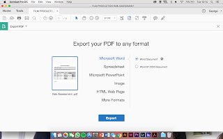


In order to edit it I had to use Adobe Acrobat to convert from a PDF document to a word document.
Thursday, 5 October 2017
Monday, 2 October 2017
Generic Research: Dochouse Cinema

Dochouse is a cinema that show only documentaries in the cinema. I used this website to check the conventions of many different types of niche and mainstream documentaries to help me follow them correctly in my work.
Subscribe to:
Posts (Atom)